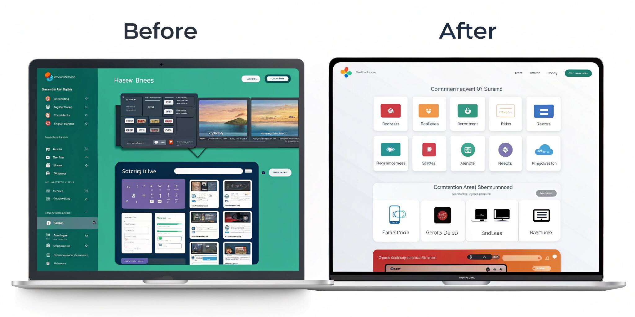
Great design is invisible—it simply works. But many businesses struggle with outdated, cluttered user interfaces that frustrate customers and harm engagement. This blog takes you through a real-life UI overhaul case study where a once-clunky interface was transformed into a seamless, modern, and clean user experience.
The Problem: Clunky, Confusing, and Outdated
The original platform faced multiple issues:
- Overloaded menus and complex navigation.
- Inconsistent color schemes and typography.
- Poor accessibility features.
- Low engagement due to frustrating workflows.
Users complained about “too much on screen,” “hard-to-find features,” and “slow navigation.”
The Overhaul Process
1. User Research & Feedback
The design team began with user surveys, heatmaps, and session recordings to understand pain points. Insights revealed:
- 60% of users struggled to find primary features.
- 45% abandoned tasks halfway due to confusing layouts.
2. Defining Design Goals
- Simplify navigation.
- Improve readability with consistent fonts and spacing.
- Enhance accessibility with proper color contrast and alt-text.
- Reduce cognitive load by removing unnecessary elements.
3. Wireframing & Prototyping
Low-fidelity wireframes were created to test layout improvements before investing in high-fidelity designs. Early prototypes helped validate:
- Simplified menu hierarchy.
- Streamlined forms.
- Clear call-to-action buttons.
4. Visual Redesign
The overhaul focused on:
- Minimalist design system with clean grids.
- Consistent typography for readability.
- Modern color palette balancing aesthetics and accessibility.
- Microinteractions to guide users without overwhelming them.
5. Usability Testing
Redesigned prototypes were tested with real users. Results showed:
- 40% faster task completion.
- 55% increase in engagement.
- Significant reduction in error rates.
The Results: From Clunky to Clean
The new UI delivered:
- Improved navigation – users found core features 2x faster.
- Cleaner workflows – fewer clicks to complete tasks.
- Happier users – customer satisfaction scores rose by 35%.
- Better brand image – modern design aligned with company’s vision.
Key Takeaways
- Start with real user feedback before making design changes.
- Focus on simplicity and consistency—less is more.
- Test frequently with prototypes before full rollouts.
- Accessibility should never be an afterthought.
Conclusion
A UI overhaul isn’t just about making things look pretty—it’s about making them work better for real users. This case study shows how thoughtful research, clean design principles, and iterative testing can transform a clunky interface into a sleek, user-friendly experience that drives engagement and satisfaction.